
Chameleon Software: Sensor Data Visualization
Supplied with every PPS sensor system, Chameleon software is a full-featured, intuitive platform built to help your team efficiently manage, analyse and visualise tactile sensor data in real time. The redesigned interface is faster, clearer and more flexible, enabling users to uncover smarter answers through improved heat-map rendering, refined 3D defaults, enhanced graph views and powerful new analysis controls. Whether you are conducting research, evaluating industrial processes or developing new products, Chameleon software delivers the tools needed to capture, interpret and export data with confidence.
Visualise tactile data more effectively with an expanded set of display options, including Line Trace, enhanced 2D and 3D heat-maps, mesh plots, and new multi-file comparison views. Recorded data can be explored using upgraded interactive tools, copied directly to the clipboard, and exported through improved single-frame, averaged-second and photo-capture options for seamless use in Excel®, MATLAB®, Python and other third-party environments. With a smoother workflow and more engaging visualisation features, Chameleon makes it easier than ever to turn complex sensor output into meaningful, actionable insights.
KEY Features:
View and control synchronized video alongside your pressure analysis.
Access real-time data, including average, max, and center-of-pressure tracking.View sensor data as a 3D colour map of the actual shape
Visualize sensor data as a 3D color map of the actual shape.
Export data in ASCII format for use in external software such as Excel®, MATLAB®, and Mathcad®.
Develop Windows apps using our simple API.
LATEST UPDATES - Beta Version of Chameleon 2026
Improved video processing and resolution
Enhanced control over recording length and speed.
View real-time data with multiple pressure visualization tools
Customization options for data export settings.
Improved control over recording length and speed
Enhanced experiment annotations capabilities
Sensor Mapping
Easily map your data across multiple sensors
Your tactile sensor could have as little as four or as many as thousands of sensing elements. Each capacitive sensing element is converted to a digital output and transmitted live to Chameleon. These digital values are then converted to physical units of pressure such as PSI or kPa and are spatially organized to represent the actual sensor geometry. You can then select specific sensors to view, or view them as a whole and display them in 2D or 3D maps.
Visualisation
Effectively visualize your data
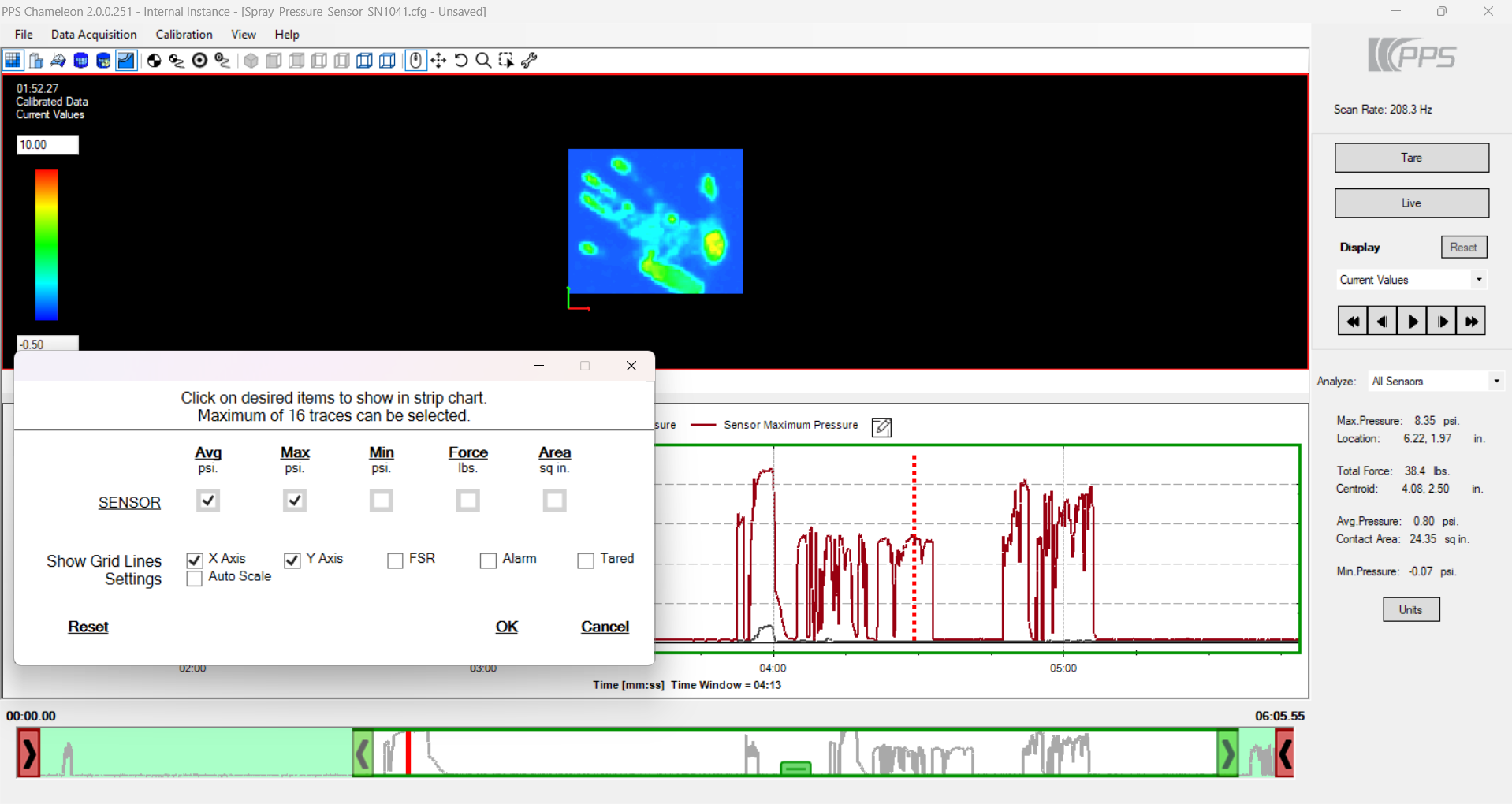
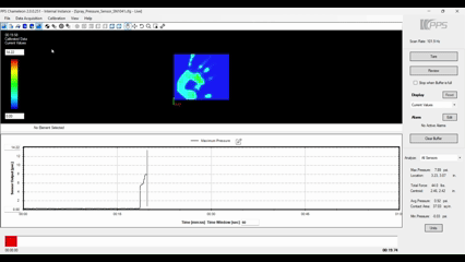
Your tactile sensor output can be visualized in 2D pseudo-color mapping (pressure mapping) or in a 3D bar or mesh graph plot that provides information on contact pressures spatially. In sensors for a small number of sensing elements (approximately a dozen), you can visualize each of the elements in a time trace plot that provides a history of the pressures over time. In instances of a high number of sensing elements (hundreds or thousands), you can plot peak, average or minimum pressure values, or sometimes force and contact area, in addition to pressure mapping.
Analysis & Data Export
Quickly access important data points and export for further analysis
Chameleon’s analysis capabilities include peak pressure, centroid, contact area and force calculations, though its primary purpose is to collect tactile data from the sensor electronics and visually display them for the user. Ability to export all or a portion of the data collected as a text file is standard for more detailed analysis through programs such as Matlab and Excel. You can also export the data into a video recording, and screenshots can be easily copied and pasted into images or presentations.
Synchronised Video
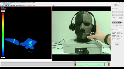
View your experiment in action beside your sensor data
The Chameleon software offers live video capture, seamlessly integrating video with the tactile pressure data. This combined data set allows you to correlate the pressure mapping with the physical events that generated it, providing a more comprehensive understanding of your experiment. To mark specific events, double-click on the line trace to open the annotation box and record the details within your data set.
Looking ahead
PPS continues to develop Chameleon as its core tactile software platform. Alongside the core version supplied with all PPS systems, PPS plans to introduce optional licensed editions to support advanced workflows and expanded functionality in future releases. Further details will be shared once development and testing of the Chameleon 2026 beta are complete.
Explore Our Tactile Sensor Solutions
Tactarray
High-Resolution Pressure Mapping for Research & Design
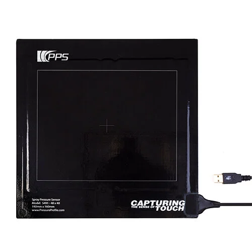
Spray Sensor
Quantitative Fine-Mist & Spray Pattern Analysis
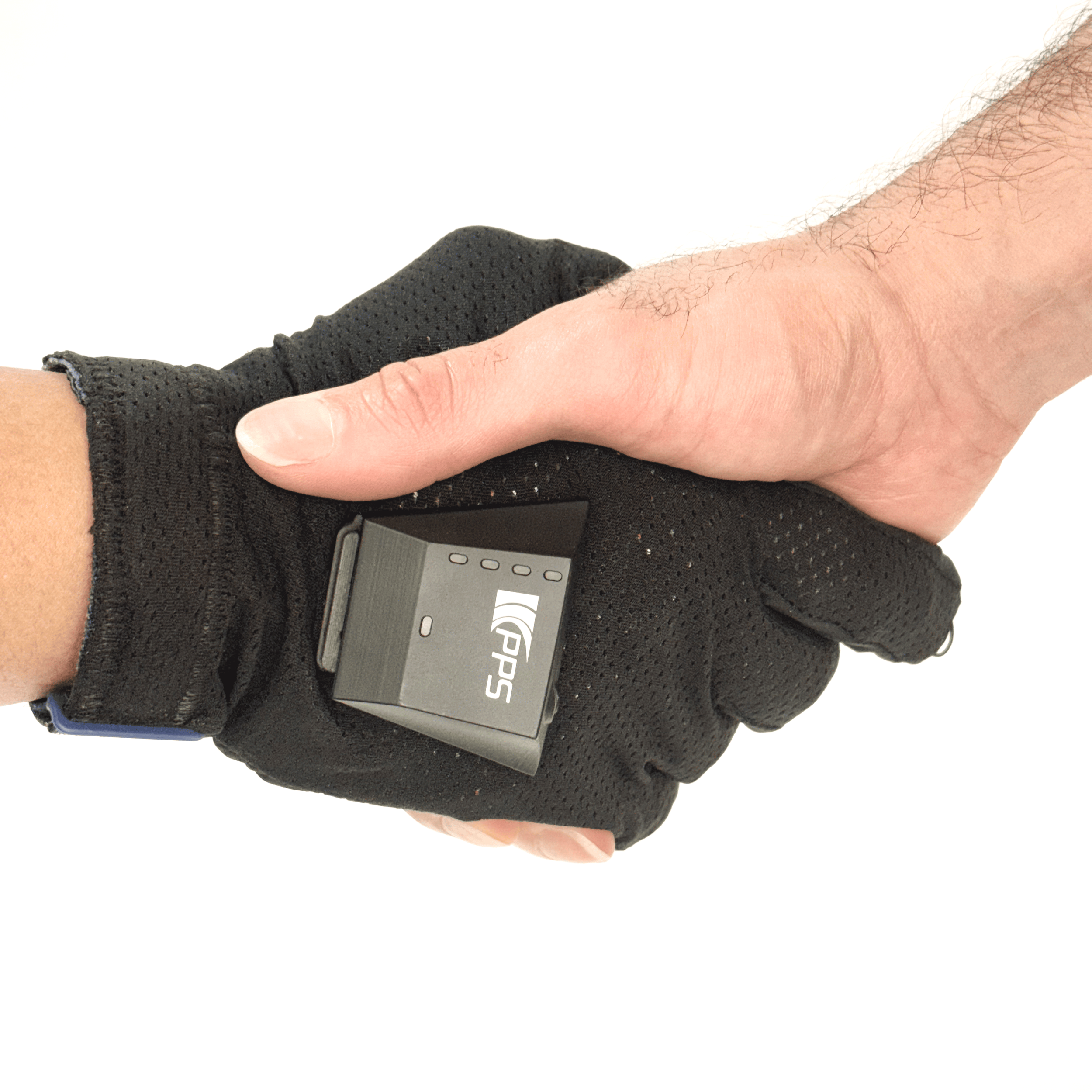
Tactileglove
Finger-Level Force and Grip Interaction Measurement
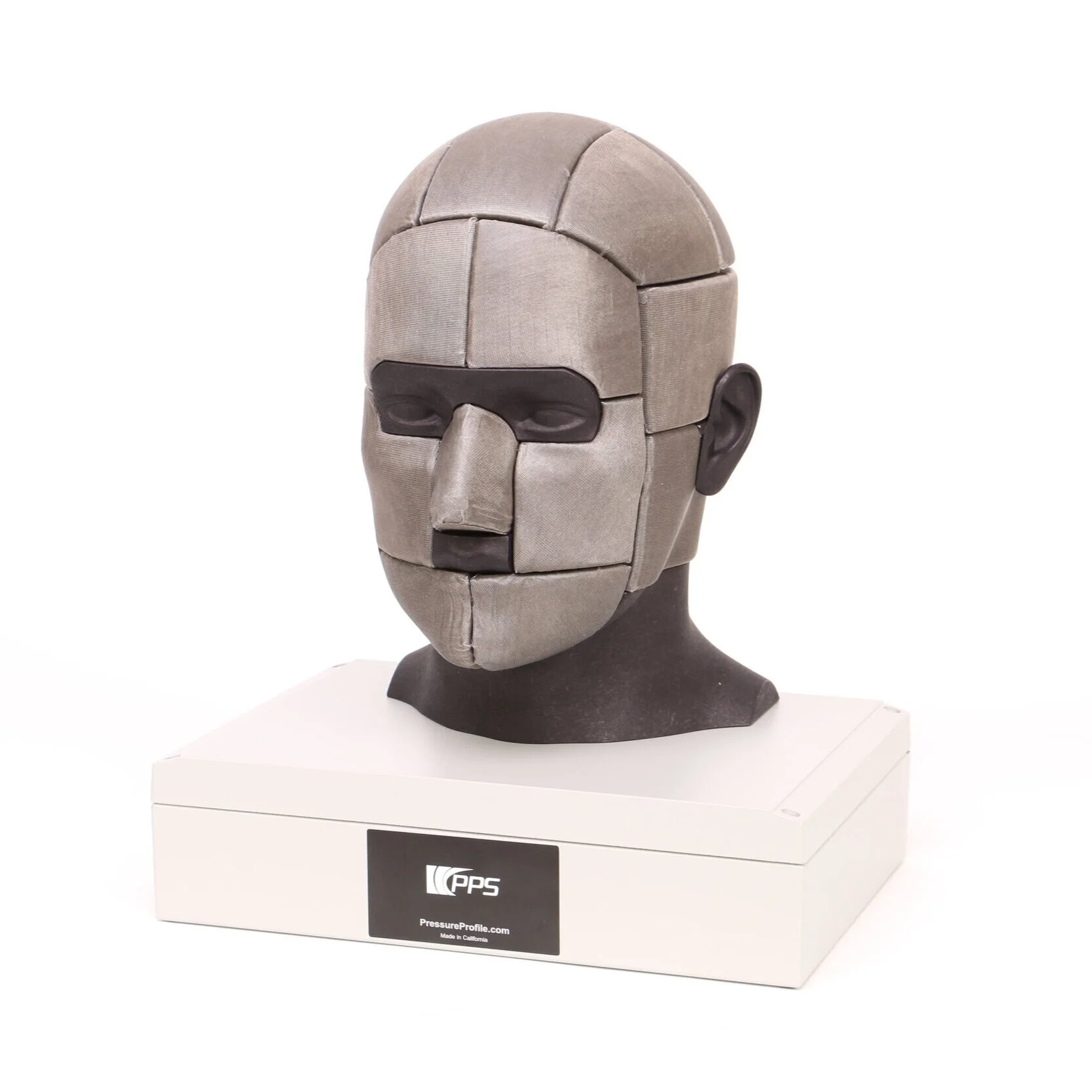
TactileHead
3D Surface Pressure Insight for Fit, Comfort & Contact